Viewing your Supply Chain on a Map

A theme we keep going back to is that you should visualize your data with a map. (You can see some examples, here, here, here, and here).   One important aspect of this is that you should see a different amount of data as you zoom in on the map.

The following example shows the demand by three different types of products at the state level.  The second example shows the same data, but reported by census tract.  So, when you are analyzing a small geographic area, you are presented with much more detailed information.

Visualization to Help Stop Dengue Fever

Back in 1854, John Snow plotted cholera on a map to help prove that the outbreak could be traced back to a water pump.  Fast forward to 2011 in Lahore, Pakistan, and the same idea is being used to prevent the spread of the mosquito borne dengue fever.  The health team is allowing a smartphone app to record the presence of infected mosquito larvae, plotting this on a map, and then using this to help determine when to best spray.  It is a clever update of John Snow’s idea and shows the power in geographical visualization.

Dengue Tracking System from Technology Review

For  more information on this application, see the recent article in The Economist, Technology Review (which is where the map is from), or IRIN.

This type of visualization is also important in network design and important to business, in general, as Justin Holman, CEO of TerraSeer, points out.

Educational White Paper on Bi-Objective Optimzaiton

IBM just published an educational white paper by Pete Cacioppi on bi-objective optimization.

This white paper provides details for the interested business user as well as the researcher into the latest thinking in solving problems with more than one objective.

The paper discusses the business benefit of viewing the trade-off curve between two objectives and how this can give valuable insights into your problem.

It also explains some of the science behind this bi-objective optimization and how  massively parallel cloud computing can effectively solve these problems.

Top 5 Models You Should Build in 2013

On SCDigest, I wrote an article about the 5 models you should build in 2013.  These are simple models meant to get you started and add value.  Here is the list, but see the SCDigest article for more detail.

#1.  Plot your demand on a map

#2.  Add the current lanes you are using to serve your customers

#3.  Reassign customer territories

#4.  Model what would happen if you lost a warehouse

#5.  Model a single product

Start Your Big Data Journey with a Map

Justin Holman, the CEO of TerraSeer, recently wrote an interesting blog post suggesting that a great place to start a Big Data journey is to build a map.  He argued that most firms  and managers don’t have the resources or technical capability to do a full-blown analysis on all their data.  But, a map is a relatively simple place to start that will allow you to visualize a lot of data quickly and in a new way (most firms still don’t use enough maps to view data.)

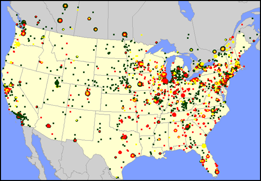
For the supply chain manager, I would agree.  As we’ve discussed before, a map can be a great way to view your customers by different types and relative demand (as seen in the map above).  It can also be a great way to see how product is flowing through the supply chain.

We have seen many cases where a company finds savings opportunities by just looking at their data on a map.  It is often the first time the managers have seen the data presented in this way.  And, it allows the managers to quickly understand their business in ways that were not obvious before.

Even if you are not doing a full-blown network design study, I would still recommend mapping your customers and supply chain.  You may learn something new.

Importance of Single Sourcing Groups of Customers


In practice, you need flexibility to single source customers and groups of customers.  (By customers, I am referring to the final ship-to location.  This could be a retail store, your distributor’s warehouse, or even an end consumer)

For example, you many minimize your costs by shipping from multiple warehouses or plants to a customer.  But, this may annoy your customers.  Or, you may only be able to send full trucks once every two months.  To avoid these problems you can single source the customer and find the best single point of delivery to that customer.  That is, your products must all travel to single warehouse and then on to the customer.

It also becomes import to single source groups of customers.  For example, for simplicity, you may want to serve all the customers in Tennessee from a single warehouse to simplify your operations.  Or, you want to serve all your customers that are in the same Sunday Paper region so you can better manage promotions.  In the construction business, you want to make sure all the customers in a region receive product from the same manufacturing plant.  Boards and shingles coming from different plants can have slightly different colors.

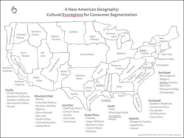
Justin Holman, CEO of TerraSeer, is doing some interesting work for the automotive aftermarket.  He put together the map you see in this post to help determine the similar regions for auto parts.  He has a post that explains the map and the fact the state boundaries are not helpful for forecasting auto parts.

If you apply his concept to network design, you might want to single the customers in each of the regions that Mr. Holman has identified.  This would simplify your decisions about what products to stock in each warehouse and would allow you to better manage demand.

Besides aftermarket auto parts, you could imagine that this analysis would apply to a wide range of products– construction materials, swimming pool products, sun screen, lawn care products, beverages, and about any other product whose demand changes by season.

Dual Sourcing Strategies and Network Design

Recently, I wrote about dual sourcing strategies in my SupplyChainDigest column.  The idea is that when firms try to decide if they should make a product in China or the U.S, they should also consider a dual sourcing strategy.

Professors Allon and Van Mieghem from Northwestern’s Kellogg School of Management have formalized this strategy in several papers and projects.

With this strategy, you can get the low cost benefit of China and the safety stock benefit of reacting to variability in the U.S.

But, there can be more to this strategy.  This discussion assumes that demand for this product is mostly in the U.S.  If demand for the product is world-wide, you need to use network design software to help determine where to make product for each market.  That is, do you make a product in each region of the world to avoid transportation costs or do you centralize production to take advantage of economies of scale.

The lessons we learned from dual sourcing still apply.  If it is better to make a product centrally because of economies of scale, then you may want to consider some local capability to handle the variability and reduce safety stock requirements.

This analysis is certainly more complex, but the extra effort can reduces costs and risks.

Lead Time and Inventory Buffers

A recent article on Fab.com (a fast rising $140 million design retailer) reminds us that there are multiple lead times in a supply chain and that inventory plays a key role.  Here is  key question (from the WSJ) and the answer (from the CEO):

WSJ: Earlier this year, your average shipping time was 15 days. How have you improved fulfillment?


Mr. Goldberg: We’re living in an Amazon world—shipping should be fast and free. We’ve invested tens of millions of dollars this year on two efforts. One is to build warehouses so that we get things in and out very quickly. The other is purchasing inventory. Last year during the holidays about 10% of our product was in inventory. Seventy percent of the products that are currently on Fab right now are in inventory, which means they’ll ship within one day of purchase, which means they’ll get anywhere in the U.S. in one to four days.

This is very interesting on a few levels.

First, Amazon (and other retailers) started out just like this– with no inventory.  In fact, back in the late 90’s, there were articles saying that on-line retailers had a huge advantage because they didn’t need to hold any inventory.  They would take the order and then have the vendor ship to the customer.  It would have been a great business model if had worked.  But, like Fab.com is finding out, customers don’t want to wait 15 days.  Like Amazon before them, Fab.com is finding out that they need to hold inventory to reduce lead times to the customers and control their business better.

Second, this shows that there are multiple lead times in a supply chain.  Presumably, Fab.com’s lead time is still 15 days.  However, because they have an inventory buffer at their warehouse, their customers now only see a 1 day lead time.  So, the inventory buffer changed the lead time buffer that the customer sees.  Inventory buffers are also very useful for buffering variability that the customer sees.

In general, a company should measure the overall lead time, but also the lead time seen by different parts of the supply chain (what does the customer see?  what does the warehouse see?  what do the plants see?).

Now, Fab.com can work on reducing the 15-day lead time from vendors knowing that the customers see the 1-day lead time.  As they reduce the 15-day lead time, the benefit will be a smaller pile of inventory at the warehouse.
 

Economist Article on Analytics and Geography

The Economist recently published a nice survey on Technology and Geography.

As more consumers (and more technicians, delivery drivers, and so on) carry smart phones with locations, it opens up many nice opportunities for geographic services, geographic analytics, and even optimization.  This opens the door to more local uses of network design technology.

Also, if you’ve done network design, you’ve seen the value of displaying data on a map.

Taking it further, Justin Holman, CEO of TerraSeer, makes a strong case that firms should be viewing more data on maps rather than in spreadsheets.  As firms collect more data about locations, geographic visualization will become more important.

Efficient Frontier

Business problems do not usually have a single correct solution.  Instead, someone has to make a tough trade-offs.

But, how do you know you fully understand the trade-offs?  That is, how can you be sure that there isn’t a better solution than the one you considering?

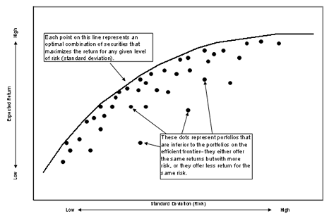
Determining the efficient frontier– a tool originally developed for finance and now applied to many business problems, will help you.  In finance, the efficient frontier is the curve of all investments that maximize return for a given level of risk (standard deviation).  The graph below (from InvestingAnswers) shows the curve and points that are not on the curve.  So, for any point not on the curve, you could find either an investment with a better return with the same risk or an investment with the same return and a much lower risk.  You still have to make the tough decision between return and risk, but the curve narrows your choices to  the best solutions.


In network design, you face similar trade-offs between cost and service levels, between capital invested and operating costs, and many more.  To better analyze these trade-offs, you need to create this efficient frontier.  Multi-objective optimization builds this trade-off curve for you.