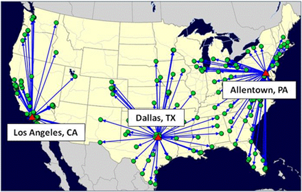
A professor from Rochester Institute of Technology pointed out that the visuals in network design can really help explain what the network looks like. It is quite bland to just say that the solution picked

Los Angeles, Dallas, and Allentown. By showing the solution with a map, you get a much better sense of what the solution actually means.
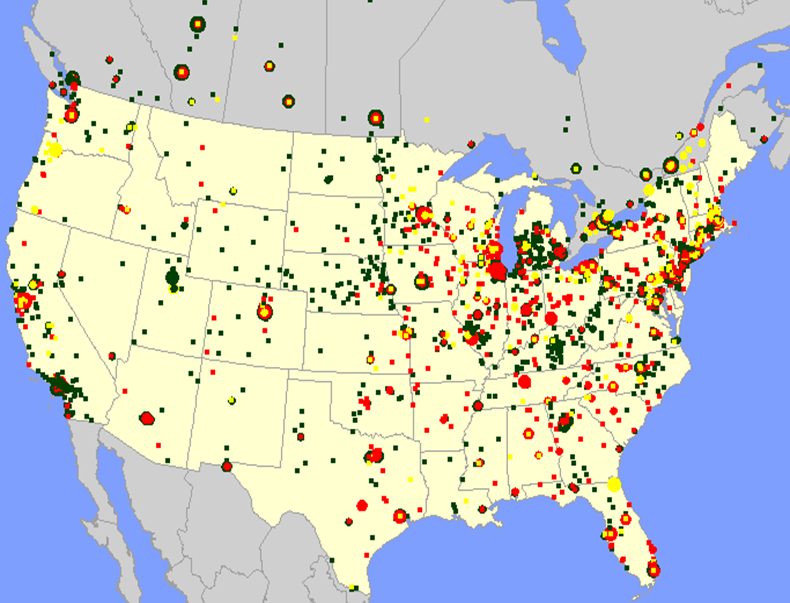
The same goes for the input. You gain a lot of insight of into your customers by plotting them on a map, sizing them by relative demand, and coloring them by different characteristics. See the map below for an example of this. This visual analytics is very important for network design. A supply chain is very complex. Showing the inputs and outputs using maps can help people understand what the model is doing.
