Viewing your Supply Chain on a Map

A theme we keep going back to is that you should visualize your data with a map. (You can see some examples, here, here, here, and here).   One important aspect of this is that you should see a different amount of data as you zoom in on the map.

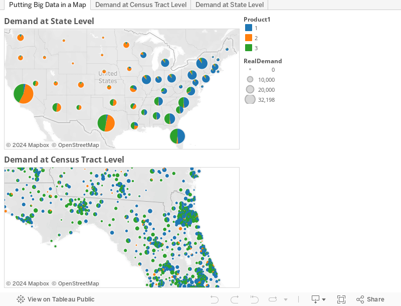
The following example shows the demand by three different types of products at the state level.  The second example shows the same data, but reported by census tract.  So, when you are analyzing a small geographic area, you are presented with much more detailed information.

WSJ Article: Supply Chain Management is the Hot New MBA Topic

Today’s Wall Street Journal featured an article on the growing popularity of supply chain management in MBA and undergraduate programs.  Here is the opening of the article:

Call it a problem of supply and demand.

With global operations becoming more complex, companies in manufacturing, retail and technology—and the consulting firms that service them—are scrambling to hire people with supply-chain expertise. But these experts are hard to come by.

Sensing growing demand, more than a half-dozen universities have recently introduced undergraduate majors, M.B.A. concentrations and even entire degree programs dedicated to procurement, inventory management and global supply-chain strategy.

This again shows the continued importance of network design.  Bringing network design to the classroom can enhance the student’s learning.  I have had good success using IBM’s LogicNet Plus in the classroom at Northwestern.  And, the students seem to get a lot out of using a commercial tool.  If you are a professor teaching this topic, we have a lot of material to help get you started.  And, drop me a note if you would be interested in a more in-depth discussion.

Visualization to Help Stop Dengue Fever

Back in 1854, John Snow plotted cholera on a map to help prove that the outbreak could be traced back to a water pump.  Fast forward to 2011 in Lahore, Pakistan, and the same idea is being used to prevent the spread of the mosquito borne dengue fever.  The health team is allowing a smartphone app to record the presence of infected mosquito larvae, plotting this on a map, and then using this to help determine when to best spray.  It is a clever update of John Snow’s idea and shows the power in geographical visualization.

Dengue Tracking System from Technology Review

For  more information on this application, see the recent article in The Economist, Technology Review (which is where the map is from), or IRIN.

This type of visualization is also important in network design and important to business, in general, as Justin Holman, CEO of TerraSeer, points out.